
OVERVIEWDesigning a powerful internal platform to simplify and centralize workflows for partners to better manage financial products for SMB customers
Role:
UX Strategy
Research & Discovery
UI & Visual Design
Prototyping
User Testing
UX Strategy
Research & Discovery
UI & Visual Design
Prototyping
User Testing
Research & Discovery
UI & Visual Design
Prototyping
User Testing
Length
3 months for MVP
with continued iterations
3 months for MVP
with continued iterations
with continued iterations
Tools Used:
Figma
Zoom (testing)
Pulse (comp. research)
AI tools for efficiency
Figma
Zoom (testing)
Pulse (comp. research)
AI tools for efficiency
Zoom (testing)
Pulse (comp. research)
AI tools for efficiency
Team:
Lead PM
FE & BE engineers
Legal / Compliance
Ops
C-Suite Execs
QA analysts
Lead PM
FE & BE engineers
Legal / Compliance
Ops
C-Suite Execs
QA analysts
FE & BE engineers
Legal / Compliance
Ops
C-Suite Execs
QA analysts
The Challenge
Our partners needed a single, user-friendly application to manage complex operational tasks—like underwriting loan applications, tracking performance metrics, and integrating with developer tools. Early on, we scoped out only MVP-level functionality which quickly scaled to include complex functionalities and workflows.
How can we provide our partners with a single, user-friendly application to simplify and centralize their workflows from onboarding with jaris to managing applications.
Our Goals:
- Workflows involved high-stakes decision-making (eg loan approvals)
- Streamline core partner workflows with a single, cohesive interface
- Deliver a seamless, configurable experience tailored to user roles
- Design an intuitive, data-informed underwriting flow that supports fast, accurate loan decisions
- Ensure scalability and flexibility as new features were added post-MVP
Key Metrics:
- Enabled faster onboarding and reduced manual intervention for new partner users with clearer role-based flows
- Created a scalable dashboard framework that could support future product features without full redesign
- Saw an uptick in scheduled demos with partners with the introduction of underwriting decision making workflows for financial product applications
DISCOVERYUser Journey
For the Partner Dashboard experience, there are two funnels within the entire user journey. One of the goals we had to tackle for
Before this initiative, our internal operations team managed onboarding manually—relying heavily on phone calls, scattered emails, and ad hoc communication. There was no centralized system to manage or track this workflow. To address this, I conducted deep discovery sessions with every team involved in onboarding—including Marketing, Operations, Engineering, and QA—to uncover pain points, understand their goals, and align on success criteria.
Solving this first funnel gave us the foundation to address the second: How do we enable our partners to issue their first loan as quickly as possible?
Our primary partner demographic was small to mid-sized payment processing platforms —typically those without the engineering resources to build and manage their own softwares to offer financial products to their customers
However, by 2024, our partner conversations shifted. Larger partners wanted more control and autonomy over the underwriting process. In response, we designed and delivered a partner-facing underwriting feature that enabled them to review, approve, or reject incoming applications directly—giving them full visibility and ownership, whi
The user journey I created with Figjam to go over all of the different aspects of the Partner’s onboarding Journey
Feature Deep Dives
ROLE-BASED USER MANAGEMENT One size does not fit all.
Early in the process, Product proposed that each new partner account should include a standard set of roles: Developer, Executive, and Marketing. But as I dug deeper into validation—through cross-functional research and stakeholder interviews—it became clear that a one-size-fits-all model wouldn't be sufficient.
For example, in my conversations with internal developers, I uncovered a critical risk: giving all users within the “Developer” role full access to Dev Tools could expose the system to security and configuration issues. To mitigate this, I worked closely with Engineering and Product to design a more flexible role structure. This included defining two distinct types of Developer roles in both the UI and backend—one with full edit access, and another with limited, read-only visibility.
This change not only improved security and usability, but also laid the groundwork for a more scalable and configurable role-based permissions system as we onboarded more complex partners.
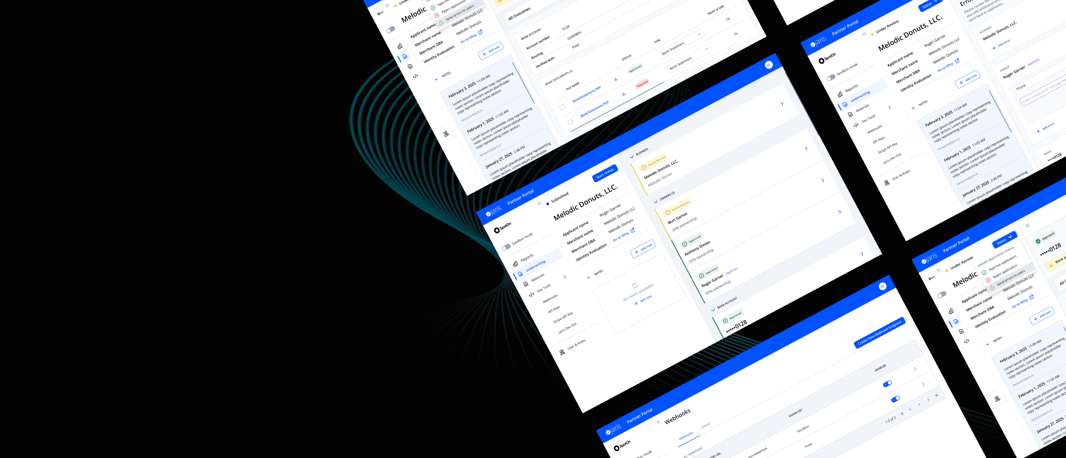
MERCHANT UNDERWRITING DECISION GATEWAYOffering Control and Centralization
At launch, our initial MVP laid the foundational groundwork for onboarding new partners. Phase I focused on getting partners up and running with core functionality: user management tools , a performance dashboard with data visualizations, and other core—but intentionally lightweight–tools to support onboarding and basic engagement.
As we transitioned into Phase II, the UX challenge grew significantly more complex. The product needed to evolve into a fully operational platform —one that could support complex workflows and real-time decisions. The underwriting process became the core of this new workflow. Partners were responsible for evaluating a range of data tied to each application and making informed, high-stakes decisions: to approve, reject, or return the application for further action. This meant the experience needed to surface critical information, such as identity verification, ownership breakdown,
By architecting this central access point, I helped transform the platform from a set of standalone tools into a cohesive, decision-support system—one that empowered partners to operate with speed, clarity, and confidence at every stage of the financial product lifecycle.
CHALLENGESDesigning for scale in a rapidly evolving environment
One of the core challenges on this project was responding to fast-changing business priorities. New features were constantly needed—and fast. As the lead UX designer, I wasn't just solving for current functionality; I was expected to anticipate the next move.
A clear example of this was our onboarding application table. The MVP version was limited to one product type, but I knew we'd soon be expanding to include additional financial products and other relevant data points. I pushed to include flexible filters early on—even when engineering resisted to save time—because I knew retrofitting them later would be far more of a lift then.
Another challenge was stakeholder pressure to show everything on screen. For example, I pushed to default the table view to only show Submitted and Re-Submitted applications, because these were the only statuses that required some kind of user action. This may seem small now, but the same thinking was applied when designing the rest of the user flow (more examples to be shown later).
UNDERWRITING WORKFLOWPrioritizing Key Information
I continued to champion the importance of clear information hierarchy throughout the design process when tackling the rest of the underwriting workflow. In this key part of the user flow, we needed to show Partners all of the variables that they would need to make a decision. These included application fields, uploaded documents that may have been required to further verify specific information, notes written by their teammate or our internal jaris staff to highlight additional details on the merchant, as well as outcome tags that were driven by Alloy, a 3rd party service that conducted identity verification, fraud prevention, and compliance (KYB/KYC) automation. These outcome tags allowed our operations team to understand any potential warnings, as well as show what passed or downright failed. These helped operations drive error handling, approving or rejecting applications.
To validate this decision, I conducted usability testing sessions with our internal operations team. The results confirmed my hypothesis: by streamlining the UI and focusing attention on what matters most, we significantly reduced decision-making time and improved partner confidence.
Design isn't just about what's visible on screen—it's about building smart, scalable systems that guide users toward clarity, action, and outcomes. This feature is a perfect example of that philosophy in action.
UNDERWRITING WORKFLOWError Handling and Resubmitted Applications
Balancing Speed, Accuracy, and Flexibility
Since 97% of applications required additional review , error handling became a critical UX focus. Issues like mismatched addresses or phone numbers were common, and we needed a streamlined way for partners to communicate these corrections back to applicants.
I collaborated closely with our operations team to identify frequent errors and co-develop a library of pre-written error messages. These templates are aimed at reducing friction and speed up resolution without sacrificing clarity. Knowing that pre-written messages covered most cases but not all, I also recommended a “custom error message” option—giving partners flexibility to address edge cases based on their unique underwriting standards.
During low-fidelity wireframing, I proposed separating the application field with the error from its associated message. This improved scannability and helped partners avoid sending incorrect or unclear instructions.
This design struck the right balance: efficient for common cases, flexible for exceptions , and always focused on reducing decision time while maintaining trust and control.
Prototype created to go through the gneeral layout and introduce error handling to the team
